
N1 SPORTS REHAB
SCOPE: brand identity
BRAND DESCRIPTORS: authentic, compelling, creative, eccentric, exploring, gothic, moody
A LOGO THAT STANDS OUT
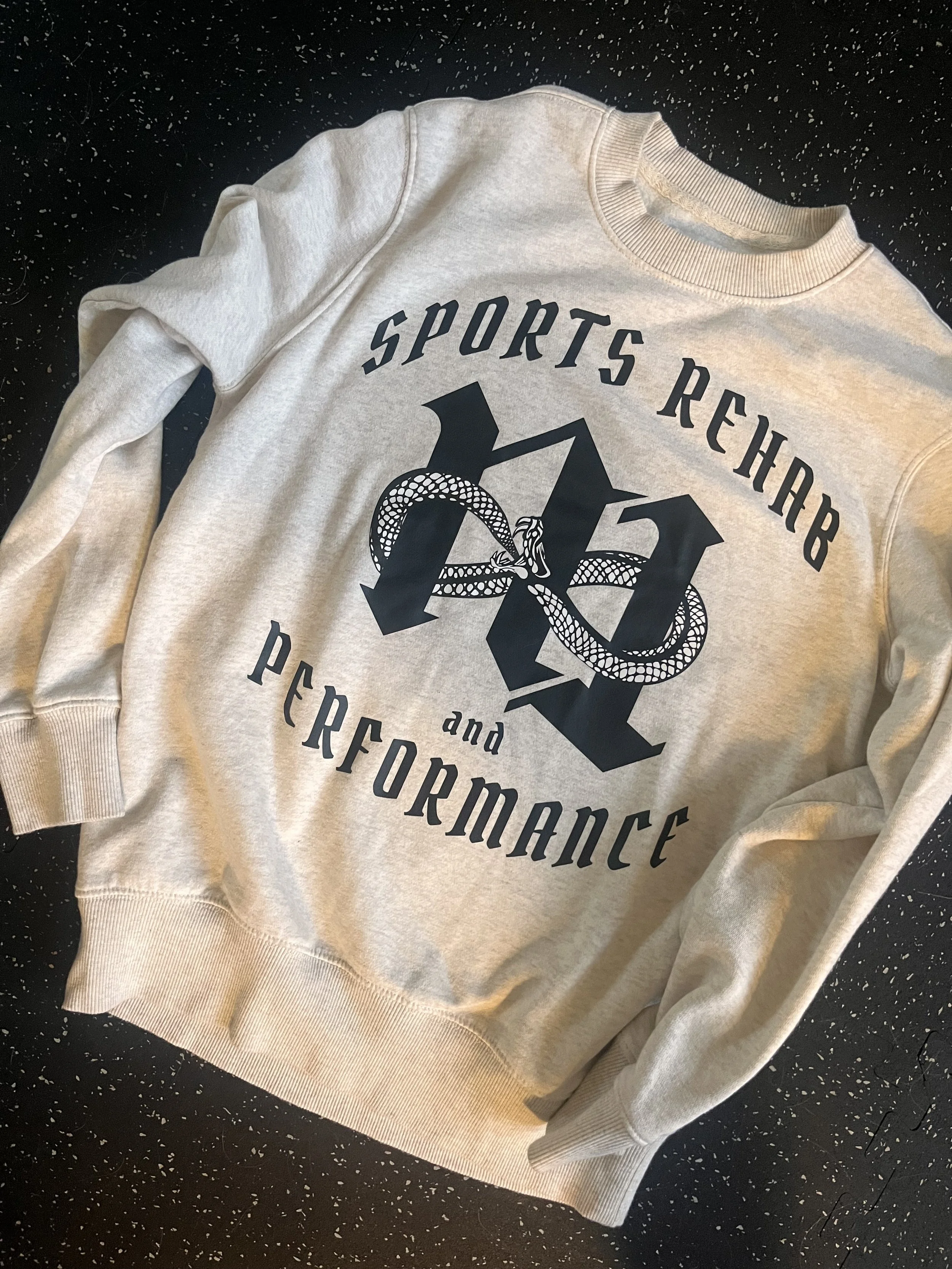
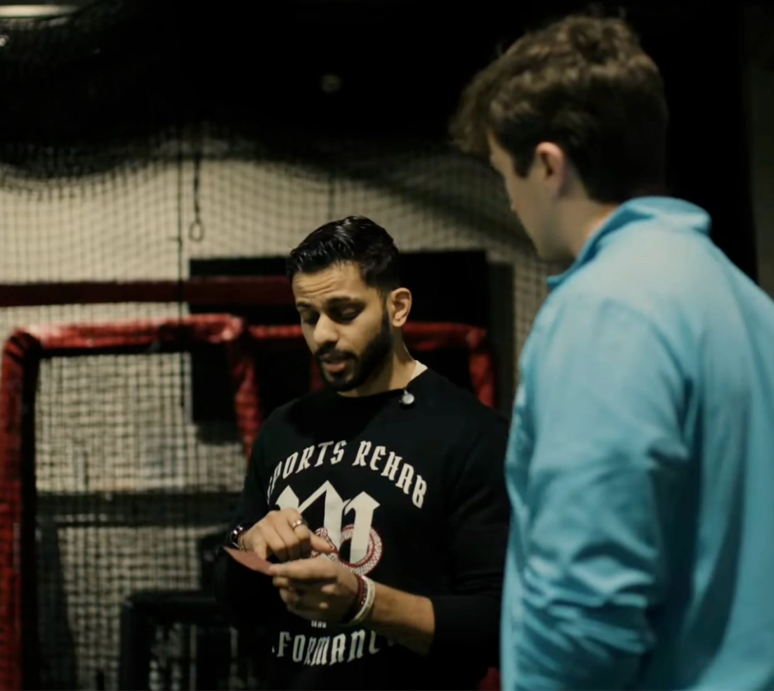
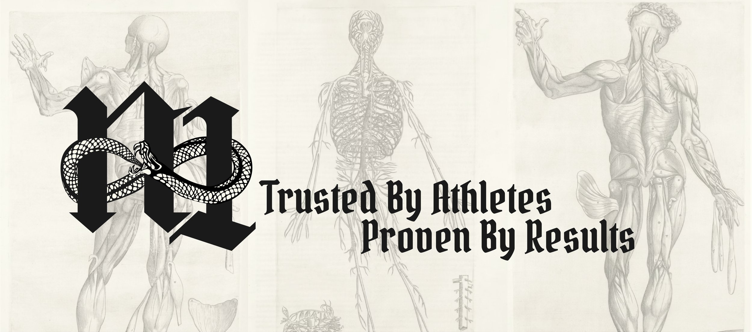
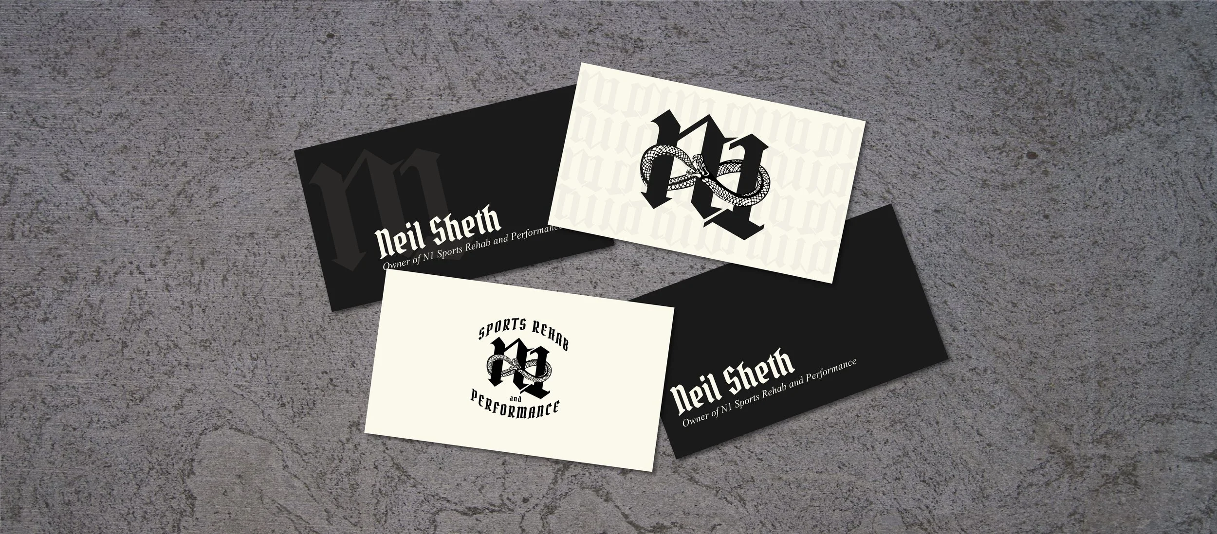
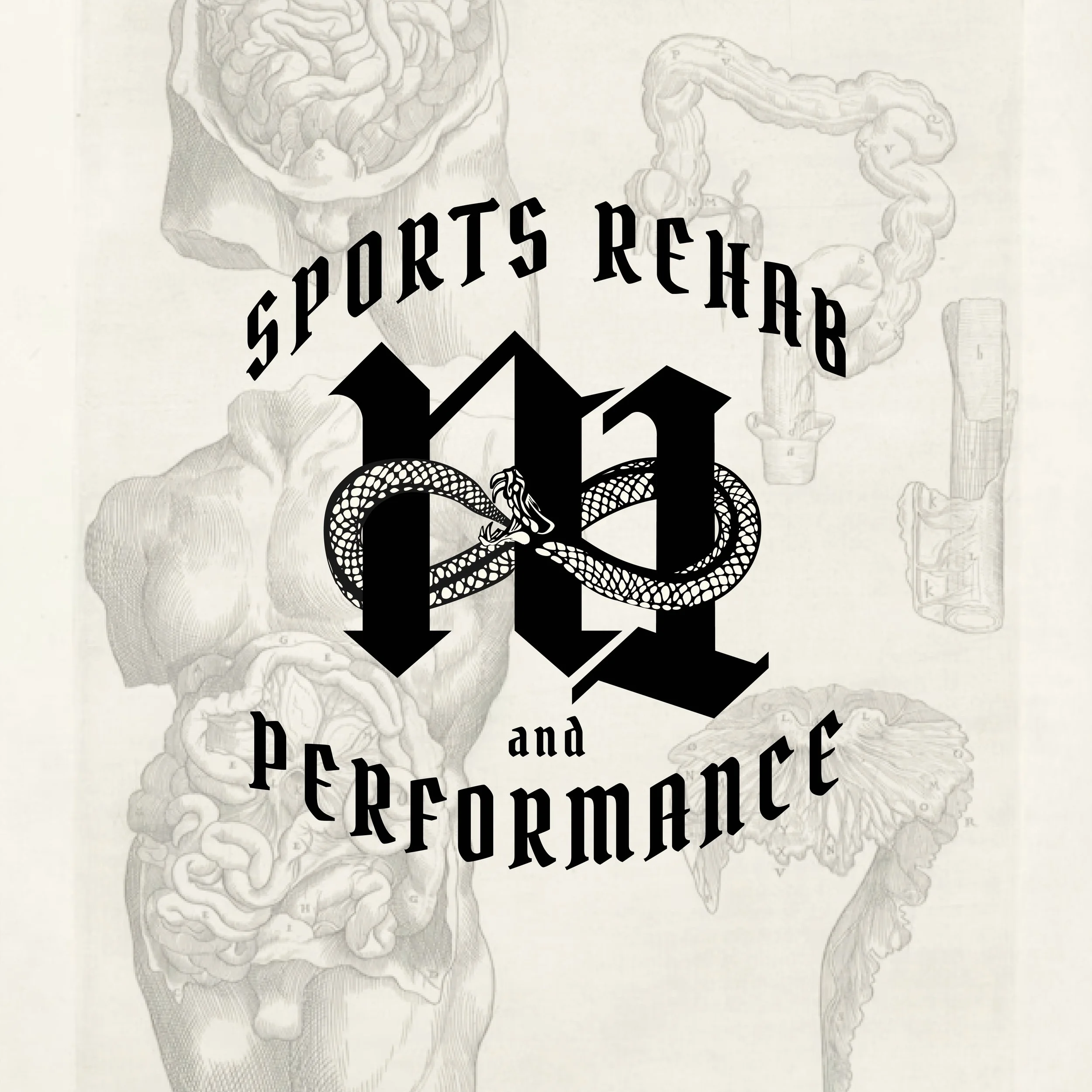
My client Neil came to me with the goal of making his business stand out. He wanted something totally unexpected in the field of sports rehab and performance and was hoping his brand could showcase his personality and his interests. He had a logo that he had created on his own but knew it was time for an update. During our consultation, he mentioned that he’s always had an interest with the ouroboros, an ancient symbol of a serpent or dragon eating its own tail, representing the cycle of destruction and rebirth. Not only did it have a personal meaning to him, but he loved how it mirrored the rehab and performance process, showing that growth is not necessarily linear.

THE DESIGN PROCESS
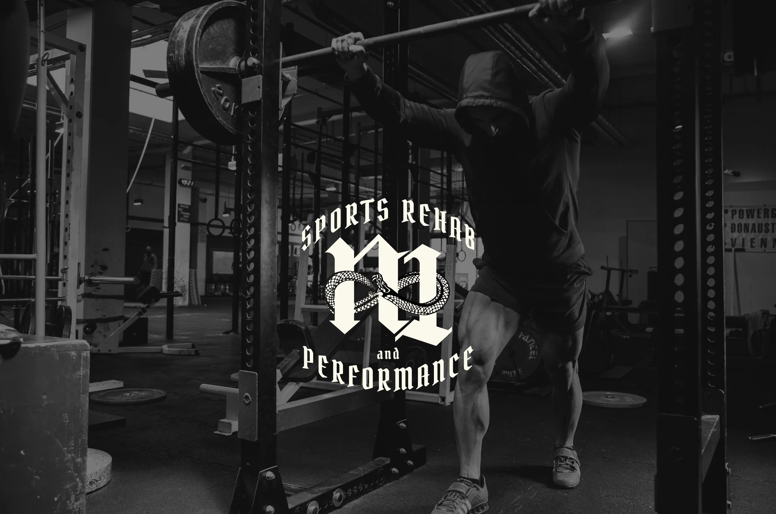
After talking to Neil about his goals for his new brand and what his existing brand looked like, I pitched the idea of going in a bit of a gothic direction. It matched his current color scheme, his interest in using an ouroboros, and it would definitely stand out among other physical therapy logos. Would it necessarily stand out amongst a group of tattoo parlors? Probably not. But it allowed us to draw inspiration and create a new brand identity that was unique to Neil and helped separate his company from his competitors.